A peek in the future: AdGuard for Android v3.0
With Adguard for Android v3.0 just around the corner, we have some early spoilers for you. Today I am going to talk big about new design, but will also touch upon some new features, as well as new approach to the old ones.
New color scheme
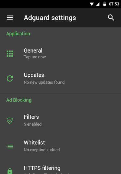
This is, no doubt, the first thing you will notice when you update to the version 3.0. Adguard is going to switch to the dark theme. We heard many users ask for it, and, after doing some mockups, ultimately we decided that it was a good idea. It really looks nice, you can see for yourself (note that this may be not the final look, but just a mockup):
We here at Adguard are all hyped about the new design, but we understand that there surely will be users who prefer the old version. If you relate yourself to those users, let me reassure you - there will still be an option to keep the old colors:
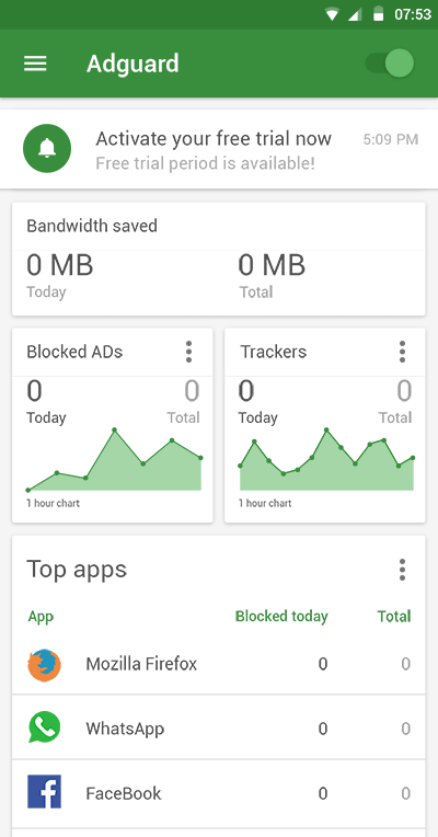
Looks familiar enough, doesn't it? The dark theme will be the default one, though, so don't freak out if everything suddenly looks different :)
Layout changes
But new design will not be a simple recoloring. We took into consideration mistakes of the past and made some changes to the layout. For example, many users complain (and rightfully so) that the main screen currently is much less functional than it could have been. We heard you, so in the new version it will be composed of a number of 'cards', each card showing some useful information (e.g. general stats, license status, firewall's top apps etc.).
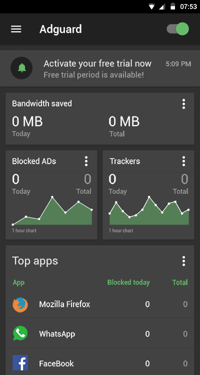
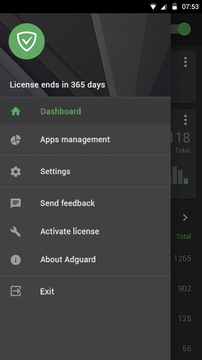
Another drastic change is menu accessibility. No more awkward top-right corner button. After the redesign, the global menu will always be reachable as a left sidebar, and standard menu will be reserved for context-depending purposes. This way the app will become more intuitive and easy to navigate through.
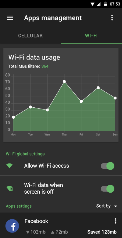
On top of that, Apps Management section will be reworked. This was another popular subject for users' criticism, and we listened to it. No specific details yet, but it will also become much more user-friendly.
Mind that the development process is still going, so this means anything can still possibly change before the release.
New features
Ok, new design is a huge thing, I think you got the idea. But there's more to v3.0 than just it. Without listing every single thing we are going to implement, let me tell about just one more, but a truly important one. I am talking about Filtering log.
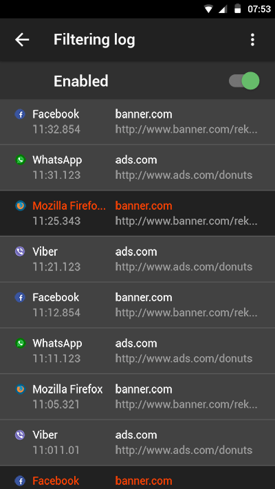
Countless times we've been asked about filtering log for Android version. Finally, we will deliver. If you are familiar with filtering log concept, you probably don't need a lot of explaining. For all the others: filtering log is a tool that allows you to monitor all requests on the go and easily see which were blocked, by what rule etc. A useful tool overall, especially for those who create their own filtering rules.
To sum it up
Sorry if this got you excited - new version is not ready yet, even for beta release. We still have things to polish, so expect the first alpha to come out in January 2017.
What do you think, is it worth the waiting? Do you like the new design? Are you going to stick to the 'old classics' theme, or maybe you even have your own vision of how Adguard should look like? Tell us in the commentary section!


